Mental Health System Usability
The Great Big Usability Survey 2013
NHSx recently launched its system usability survey for Mental Health (plus Community and Ambulance) which had me thinking back to 2013 and the survey Joe McDonald and myself ran. So, I’ve dug out the data to look back at some of the interesting findings and give a flavour of what we can expect from the current survey.
The results of this new survey though will only be as good as the data gathered, the more data the better. So if you know any front line clinicians who haven’t completed it yet …..the closing date is 10th September.
TLDR;
It’s a bit of a long article this one, but it was such an important subject it felt warranted. I’ve included some of the detailed findings from the survey in 2013 along with a link to the cSUS work that Marcus Baw did in 2015. It is great to see usability now picked up nationally by NHSx but the survey will only be as good as the response rate. More frontline staff rating more systems will only increase the richness and validity of the results. It will also be harder for suppliers to dismiss, as I’m sure some will! That said, one of the take homes from the 2013 work is how the same system can be perceived very differently by different staff and across different Trusts. Every CIO and CCIO should want to know their staff are a) using the best system and b) it’s been deployed well. Here’s the opportunity to understand this by promoting this survey internally to users. Back in 2013 the survey showed our choice of systems was just “OK” –8 years on and given the advances in technology are things any better? We’ll find out in a few months time. I may even map this data on to the new survey and see how far we’ve come…
Methods
We chose the Brooke (1995) System Usability Scale (SUS) model as it is a fairly quick tool for users to complete. Also not knowing what the response rate would be it had decent reliability with limited data. SUS consists of 10 questions scored as a 5 point Likert scale from which a rating is calculated for the system in question. The survey was administered using Google Survey and it was distributed through existing informal and formal networks and promoted on social media.
SUS score was collected along with staff role and employing organisation for the respondent. This enabled the findings to be aggregated and plotted by Trust, system and role. The resultant score and resulting analysis below is best viewed in the context of the following diagram to give an indication of usability. Back in 2013 we were really hoping for systems to hit 67 upwards meaning they are rated as “Good” or “Excellent”.

Response
Given the fairly limited budget (effectively nothing!) we were pretty surprised and very pleased by the response rate, with nearly 1,200 responses across 54 of the 56 Mental Health Trusts at the time. A couple of Trusts promoted it internally accounting for around 75% of responses, but when these organisations were filtered out it still left a fairly reasonable spread of responses across organisations.

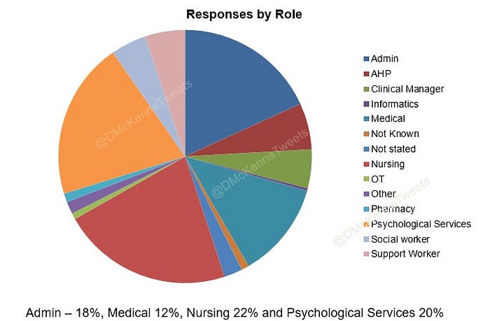
There was also a good spread of responses from different professions using systems.
Crucially though, there was good coverage across systems resulting in ratings for 22 systems in total. These systems ranged from some very large established systems, to smaller niche systems and some in-house systems. Though a few systems received low numbers of ratings, there was a really good response for the market leading systems and enough to be considered valid for SUS.

So, how did the systems compare?
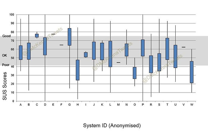
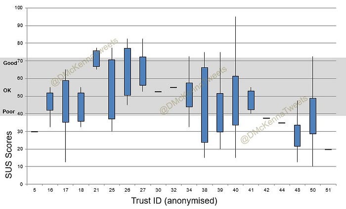
Taking into account low response rates for some systems, there were no real stand out systems rated wholly “Excellent”, though some systems clearly rated better than other. Overlaying the adjective descriptions from the SUS scale shows most systems fell into the range above “Poor” and below “Good“ so basically “OK”. There was however, quite a wide distribution of answers for most systems as shown in the box plot below.
Did Job Role make a difference?
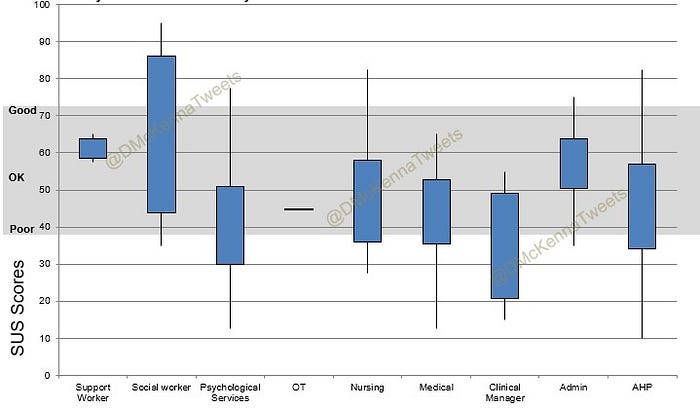
The short answer is “Yes!”. When looking at all systems Medical staff were least likely to rate a system highly closely followed by AHPs and Nursing staff. Administration staff were relatively happy with the systems. Does this tell us the systems aren’t really designed for the staff who are using them on the frontline? The greatest variation and least agreement was amongst Informatics staff…but that’s nothing new!

The picture looks similar when you consider the ratings by staff role for an individual system. Administrative staff again scoring systems more favourably than frontline staff.
Did Organisation make a difference?
Looking at the system rating by organisation again shows a lot of variation between organisations. Also, for some organisations there was a lot of variance within the organisation whereas in others there was a more consistent response. Some of this was due to sample size, but not always.
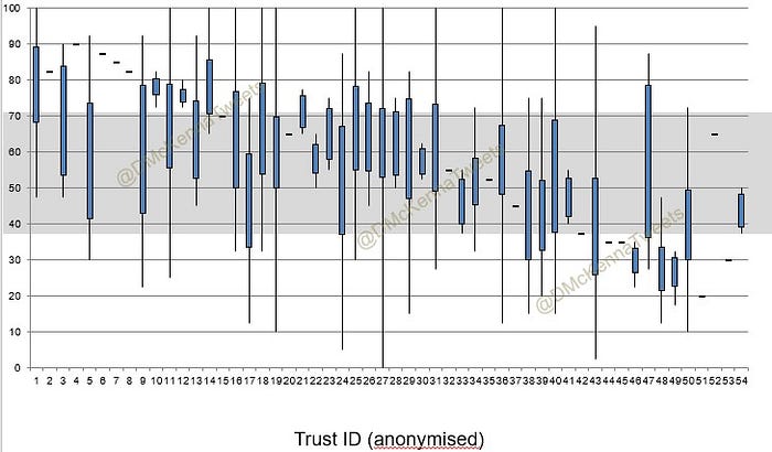
Things got really interesting though when the scoring was analysed for the same system across multiple organisations. This again shows a lot of variation but these results would suggest the system is only part of the usability equation and local factors perhaps such as access, stability, configuration, training, support etc are equally important.
Conclusions
The conclusions we were able to draw from this work in 2013 was that the current choice of systems in Mental Health were at best just “OK”. This was not really good enough.
The systems worked better for some users than others —was this a “one size fits all” approach to usability? Could it be that many systems started off mainly used by administrative staff before being used as clinical systems? Whatever the reason, there certainly was room for improvement to increase the usability of systems for frontline staff.
What was quite stark though was that the same system could rate very differently across different Trusts. Can a Trust really make a good system poor and make a poor system work well? It would appear so. A few years after this survey NHS Digital carried out the Digital Maturity Assessments (DMA), and some Trusts went on to be Global Digital Exemplars. I might revisit the data to see if DMA scores and GDE status made a difference….
Final Thoughts on the 2013 survey
This was never intended to be a peer reviewed academic exercise, the time and money just wasn’t available. There were some limitations as the response rates were quite different between Trusts and systems. Not all systems were the same with some smaller niche systems compared against quite big and extensive systems. There was also the prospect of a supplier or Trust “gaming” though to be fair the data didn’t seem to suggest this. Despite the limitations of this though, I am very proud to have been part of it and its been fun looking back over the results
I think this may have been the very first system usability survey across a sector in the NHS and there was a follow up by Marcus Baw using a version of SUS adapted for clinical use — cSUS. Check out his medium write up here.
System Usability in 2021
One of the things on the wish list after the 2013 survey was for this work to be properly funded, ideally by a national organisation and run on a regular basis. I’m really excited that NHSx are running a “grown up” version of this partnering with KLAS https://www.digitalhealth.net/2021/08/nhsx-launches-national-survey-to-better-understand-epr-usability/
As a CIO I am really keen to see two things in the results; how does the system my organisation run compare to others on the market — we want the best solution we can have for our clinical staff. Secondly, from the 2013 survey we learned the local factors are as important and I want to see how my organisation benchmarks against my peers and find opportunities to improve.
We will only find this out if Trusts promote this internally and we get decent response rates. Completing the survey is just the start of the learning and sharing. The results from this will help us all better understand the market and how we’ve implemented systems and if we are getting the maximum benefit for our frontline clinicians and ultimately patients.
